The Cracker Barrel logo is one of the most recognizable visual identities in American casual dining. For decades, the restaurant chain has used its logo to communicate a sense of Southern hospitality, country-store tradition, comfort food, and nostalgia.
The familiar imagery has become closely associated with Cracker Barrel restaurants and their distinctive old-fashioned atmosphere.
In recent years, the company’s branding has attracted renewed attention because of changes to its logo and visual identity.
For longtime customers, the difference between the old Cracker Barrel logo and the new Cracker Barrel logo is more than a design change.
The logo has been part of the brand’s identity for generations, so changes naturally create curiosity and discussion.
This guide explains the history of the Cracker Barrel logo, what the traditional design represented, how the newer branding differs, and why companies such as Cracker Barrel periodically update their visual identities.
What Is the Cracker Barrel Logo?
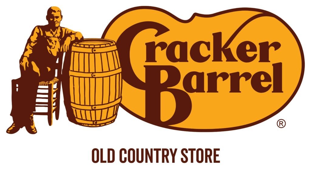
The Cracker Barrel logo is the primary symbol used to identify the Cracker Barrel restaurant and retail brand.
The company’s name is the central element of the branding, while its traditional identity has also been strongly connected with an illustrated character known as Uncle Herschel.
The logo fits the company’s broader concept. Cracker Barrel restaurants are designed around the idea of an old-fashioned country store and restaurant.
Customers may encounter wooden furnishings, rocking chairs, country-style merchandise, fireplaces, and other elements intended to create a nostalgic atmosphere.
Because the logo is connected to this overall experience, it has historically served as more than a simple business name. It helps communicate the personality and heritage of the brand.
History of the Cracker Barrel Logo
Cracker Barrel was founded in 1969, and its branding developed around the concept of combining a restaurant with a country store. The company wanted to create an environment that felt familiar and different from a conventional roadside restaurant.
The logo became an important part of this concept.
Traditional Cracker Barrel branding used imagery that reflected an earlier American country-store environment. One of the most recognizable elements was the image of Uncle Herschel, a character based on an actual person associated with the company’s history.
Uncle Herschel was shown sitting beside a barrel. His appearance helped reinforce the company’s old-fashioned country-store theme.
Over time, the image became strongly associated with Cracker Barrel. Customers could recognize the restaurant from its logo and roadside signs even before seeing the full building.
Who Is Uncle Herschel?
One of the most frequently asked questions about the Cracker Barrel logo is the identity of the man shown in the traditional design.
The character is known as Uncle Herschel. The design was inspired by Herschel Roberts, a relative of Cracker Barrel founder Dan Evins.
The character was created to represent the kind of person customers might associate with an old-fashioned country store.
Uncle Herschel became an important part of Cracker Barrel’s visual identity. His appearance communicated ideas such as friendliness, familiarity, tradition, and a connection to the past.
For many years, seeing Uncle Herschel beside the Cracker Barrel name immediately brought the restaurant brand to mind.
What Does the Barrel Represent?
The barrel is another important part of the brand’s identity.
The name “Cracker Barrel” refers to the traditional country-store environment where barrels of crackers and other goods could be found. General stores historically used barrels and containers to store and display products.
By incorporating the barrel into its branding, Cracker Barrel connected its restaurant concept with the traditional country-store experience.
This helped distinguish the company from other restaurant chains.
Rather than presenting itself simply as a place to eat, Cracker Barrel created a broader environment that combined food, shopping, décor, and nostalgia.
The Old Cracker Barrel Logo
The old Cracker Barrel logo is particularly familiar to longtime customers.
Its most recognizable version included the company name along with Uncle Herschel sitting beside a wooden barrel. The character’s clothing and pose were designed to create an old-fashioned country-store appearance.
The overall design communicated several ideas
- Traditional American culture
- Country-store heritage
- Southern hospitality
- Familiarity and comfort
- Nostalgia
- A relaxed dining experience
The logo also worked well with the physical design of Cracker Barrel restaurants. Large roadside signs and building exteriors often incorporated the company’s recognizable branding.
As a result, the logo became closely connected to the complete Cracker Barrel experience.
Why Was the Old Logo So Recognizable?
There are several reasons the traditional logo became so memorable.
First, the character made the branding different from the logos of many competing restaurant chains. Instead of relying only on typography, Cracker Barrel used a recognizable person and setting.
Second, the branding was consistent with the restaurant environment. Customers saw similar visual themes in the restaurant, country store, merchandise, advertising, and signage.
Third, Cracker Barrel maintained its identity for many years. Consistency can be extremely valuable in building brand recognition.
For customers who grew up visiting Cracker Barrel, the logo may also have emotional associations with family meals, road trips, holidays, and special occasions.
The New Cracker Barrel Logo
The new Cracker Barrel logo reflects a more contemporary approach to the company’s visual identity.
Modern branding needs to work across many different formats. A logo may appear on a large restaurant sign, website, smartphone screen, social media profile, digital advertisement, menu, packaging, or mobile application.
Simplifying a logo can make it easier to reproduce and recognize across these different environments.
The updated Cracker Barrel branding places greater emphasis on a clean and contemporary presentation while continuing to use the company’s recognizable name.
This type of redesign is common among established companies attempting to modernize their appearance without completely abandoning their history.
Old vs. New Cracker Barrel Logo
The easiest way to understand the change is to compare the two approaches.
| Feature | Old Logo | Newer Branding |
|---|---|---|
| Overall style | Traditional and nostalgic | Cleaner and more contemporary |
| Main identity | Name plus historical imagery | Stronger emphasis on brand name |
| Uncle Herschel | Major visual element | Reduced or removed from prominent branding |
| Country-store feeling | Very prominent | More subtle |
| Digital flexibility | More detailed | Designed for modern applications |
| Brand personality | Strongly nostalgic | Heritage combined with modernization |
The difference is not simply about appearance. It represents two different approaches to communicating the brand.
The traditional logo emphasized the past and country-store experience. The newer approach seeks to preserve recognition while making the brand more adaptable to modern marketing.
Why Did Cracker Barrel Change Its Logo?
There are several practical reasons an established company might redesign its logo.
1. Modernization
Brands need to evolve as customer expectations change. A logo that was effective decades ago may eventually appear dated to some audiences.
A modern design can make a company look current without changing its entire identity.
2. Digital Use
Today’s logos need to work on small screens and digital platforms.
A simplified design can remain recognizable when displayed as a small website icon, social media profile image, or mobile graphic.
3. New Customer Audiences
Established companies often want to attract younger consumers while retaining existing customers.
Updating the visual identity can help communicate that the company is prepared for the future.
4. Consistent Branding
Companies use logos across many channels. A refreshed design can help create a consistent visual system across restaurants, websites, advertising, merchandise, packaging, and digital platforms.
5. Broader Brand Strategy
A logo redesign can accompany larger changes in a company’s marketing or business strategy. The logo itself may be only one part of a much broader effort to update the customer experience.
Does the New Logo Remove Cracker Barrel’s History?
Not necessarily.
A company can modernize its visual identity while continuing to recognize its heritage.
Cracker Barrel’s history remains an important part of the brand because its restaurants are built around a country-store concept. The atmosphere, décor, food, merchandise, and customer experience all contribute to that identity.
The logo is therefore only one component of the brand.
Even when the visual design changes, customers can still recognize Cracker Barrel through its name, restaurants, products, and overall atmosphere.
Why Customers Care About the Logo
Logo changes can create strong emotional reactions because customers often associate brands with personal memories.
For Cracker Barrel customers, the traditional logo may remind them of family dinners, vacations, highway stops, or visits with friends.
That emotional connection explains why even a relatively small branding change can become a major topic of conversation.
Some customers appreciate a refreshed appearance, while others prefer the traditional design because it feels more authentic to the brand’s heritage.
Both reactions are understandable.
Is the New Cracker Barrel Logo Better?
There is no single answer.
From a graphic-design perspective, a simpler logo may offer advantages for digital marketing, mobile screens, advertising, and modern brand systems.
From a nostalgia perspective, the traditional logo has a unique personality that many customers immediately associate with Cracker Barrel.
The best logo is ultimately the one that effectively communicates the company’s identity to its intended audience.
For Cracker Barrel, that means balancing two important qualities:
Tradition + Modernization
If the branding becomes too traditional, it may struggle to appeal to new audiences. If it becomes too modern, it could lose some of the distinctive personality that made Cracker Barrel recognizable.
Maintaining that balance is one of the biggest challenges for the company.
Cracker Barrel Logo and Brand Recognition
Brand recognition is especially important for restaurants because customers often make decisions quickly.
A recognizable logo can help someone identify a restaurant while driving on a highway, scrolling through a website, viewing an advertisement, or searching online.
Cracker Barrel has built strong recognition over many decades.
The company name, restaurant architecture, country-store concept, signage, and traditional imagery all contribute to that recognition.
Even if one element changes, the combined identity can remain familiar.
The Logo Is Only One Part of the Brand
It is important to remember that a logo does not define an entire company.
Cracker Barrel’s identity includes many elements, such as
- Restaurant design
- Country-store merchandise
- Menu and food presentation
- Interior décor
- Rocking chairs
- Advertising
- Packaging
- Website and digital platforms
- Customer service
- Restaurant signage
Together, these elements create the customer experience.
A new logo therefore does not automatically mean that everything about Cracker Barrel has changed.
What Can We Learn From the Cracker Barrel Logo?
The evolution of the Cracker Barrel logo provides an interesting example of how brands balance heritage and change.
A successful historic brand often needs to preserve the elements customers recognize while adapting to new technologies and audiences.
Cracker Barrel’s traditional identity was built around nostalgia. Its newer branding demonstrates the difficulty of modernizing a nostalgic brand without losing the characteristics that make it distinctive.
This is a challenge faced by many established companies.
The lesson is simple: good branding evolves, but strong brands protect the parts of their identity that customers value most.
Frequently Asked Questions
What is the Cracker Barrel logo?
The Cracker Barrel logo is the primary visual identity of the Cracker Barrel restaurant and country-store brand. Its traditional design is strongly associated with Uncle Herschel and the company’s country-store heritage.
Who is the man in the old Cracker Barrel logo?
The traditional character is known as Uncle Herschel. The character was inspired by Herschel Roberts, a relative of Cracker Barrel founder Dan Evins.
What does the Cracker Barrel barrel represent?
The barrel reflects the company’s country-store concept and its connection to the traditional general-store environment associated with the Cracker Barrel name.
Why did Cracker Barrel update its logo?
The updated branding is part of the company’s effort to present a more contemporary visual identity that can work effectively across modern marketing and digital platforms.
Is the old Cracker Barrel logo still important?
Yes. The traditional logo remains an important part of Cracker Barrel’s brand history and is strongly associated with longtime customers and the company’s nostalgic identity.
What is the difference between the old and new Cracker Barrel logos?
The traditional design emphasized Uncle Herschel, the barrel, and a country-store aesthetic. The newer branding uses a cleaner and more contemporary presentation with greater emphasis on the Cracker Barrel name.
Conclusion
The Cracker Barrel logo is much more than a simple company symbol. It represents decades of branding, nostalgia, country-store traditions, and customer memories.
The traditional logo became recognizable through its combination of the Cracker Barrel name, wooden barrel, and Uncle Herschel character. For longtime customers, these elements became an important part of the restaurant’s identity.
The newer branding takes a more contemporary approach, reflecting the changing needs of modern businesses.
Digital marketing, smartphones, social media, online ordering, and other platforms require logos that can work clearly at different sizes and in different environments.
The contrast between the old Cracker Barrel logo and new Cracker Barrel logo highlights the challenge faced by established brands: how to modernize while preserving the identity customers already know.
Cracker Barrel’s strongest asset is its recognizable heritage. Its future branding will likely depend on how effectively it combines that heritage with a modern approach.
Whether customers prefer the traditional design or appreciate the newer look, the history of the Cracker Barrel logo demonstrates the powerful role visual identity plays in shaping how people remember and experience a brand.